Table of Contents

The goal for this lesson
By the end of this lesson, you will:
- Be able to explain to someone what Flexbox is
- Understand how Flexbox can make your workflow faster and WAYYYY less frustrating
- Have a firm understanding of basic Flexbox syntax and patterns
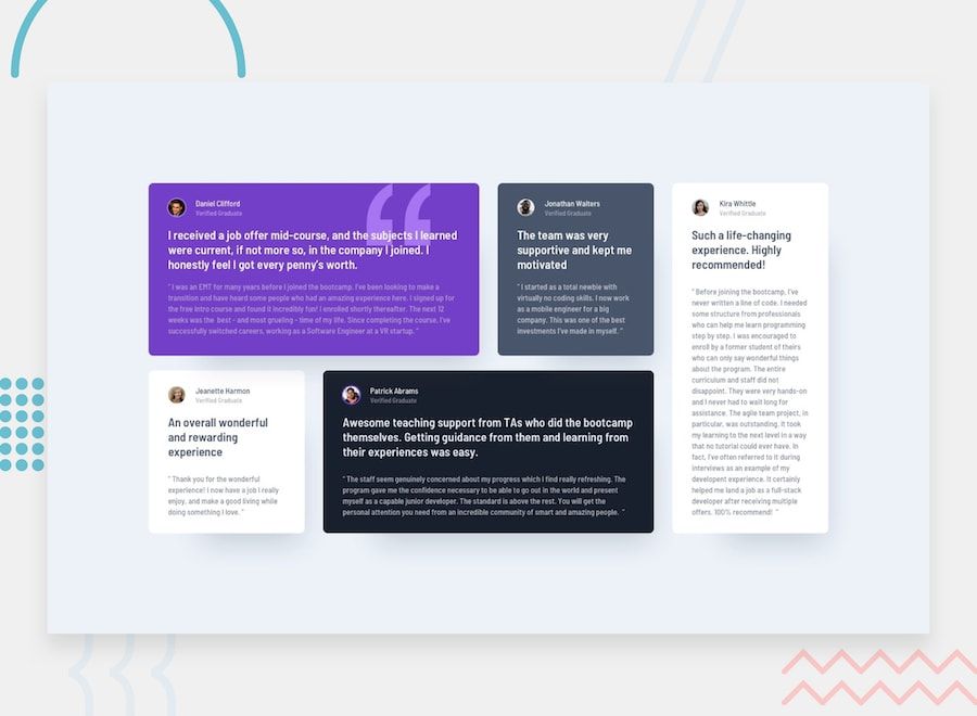
- Build the following design with Flexbox:
What we are covering in this lesson
- What is Flexbox?
- What can Flexbox do for us?
- Simplify layouts in CSS
- Reduce reliance on media queries for responsive design
- Basic Flexbox Concepts
- Flex container vs. Flex items
- Main axis vs. Cross axis
- Aligning and spacing flex items
- Flex wrap
- Flex sizing
- A Frontend Mentor HTML/CSS Challenge with Flexbox!
Let's Begin - What is Flexbox?
Flexbox is a one-dimensional CSS layout system enabled by a single CSS property:
.container-element {
  display: flex;
}
By setting this property on an HTML element, all of that element's direct children will behave in a totally different way than we previously discussed.
Remember from our CSS crash course when we talked about the "normal flow" of HTML elements? We talked about block, inline-block, and inline HTML elements. To review:
- Block element - Breaks to a new line, respects width/height properties, 100% width of container by default
- Inline Block element - Respects width/height properties, but does not break to a new line and does not take up 100% width of container by default
- Inline element - Does not break, does not respect width/height properties, does not take up 100% width of container by default
These are the "default" display types. By adding display: flex to an HTML element, we can unlock a tremendous amount of possibilities!
What Can Flexbox Do for Us?
I could tell you or I could show you. Plenty of resources tell you. Let me show you.
Here is a CSS layout WITHOUT using Flexbox. Read through the CSS and particularly pay attention to the "layout properties" section. Notice how I am using lots of widths and margins to get the layout how I want it. Before Flexbox was released, this is how you might write the CSS.
Now that we have Flexbox, we can achieve the same layout with a lot less CSS. Notice how many lines of CSS we were able to remove below. Also, notice that we no longer need a bunch of percentages, floats, and absolute positioning to achieve this layout!
Let's look at another example. In the Codepen below, I have centered a div container to the middle of the screen WITHOUT using Flexbox. This requires a few CSS tricks that are not all that intuitive!
The next example is identical to above except now, we are leveraging flexbox to easily center this div.
In that last example, we went from this:
/* Legacy solution */

.container {
  height: 100vh;
}

.div-to-center {
  max-width: 250px;
  margin: 0 auto;
  position: relative;
  top: 50%;
  transform: translateY(-50%);
}
To this:
/* Flexbox solution */

.container {
  height: 100vh;
  display: flex;
  justify-content: center;
  align-items: center;
}

.div-to-center {
  max-width: 250px;
}
In my opinion, our Flexbox solution is simpler and easier.
In summary, here are the main reasons why you should learn Flexbox.
- Easier to design responsively
- Less CSS code
- Less calculations
- Aligning and centering content is WAY EASIER
From Floats to Flexbox and Grid
Before Flexbox, web developers used "floats", "clearfixes", and a bunch of other "hacks" to get the layout of their webpage looking good. CSS was never intended for complex layouts in the beginning, so when websites started using navbars, sidebars, footers, and other layouts, they needed to find a "workaround" to their problems.
When Flexbox was introduced, the CSS layout game changed. We can now easily build complex layouts without "CSS Tricks".
But shortly after Flexbox came about, this thing called "CSS Grid" was released into most major browsers. Like Flexbox, CSS Grid aims to make CSS layouts easier.
If that's the case, why are we learning Flexbox? Why not skip it and learn CSS Grid? Here are two reasons why:
- Flexbox and CSS Grid are NOT mutually exclusive. They work together. I'll show you how in future lessons.
- Flexbox is "required" knowledge for the modern front-end web developer.
The next lesson of this full-stack series will be about CSS Grid, and luckily, it follows a very similar structure to Flexbox. In other words, learning Flexbox will help you learn CSS Grid quicker.
While we will not be covering CSS Grid in this lesson, many of the concepts here will carry forward to when we do learn it!
Flex Containers vs. Items
We have already used the concept of "containers" in previous lessons, but we haven't looked at it in isolation. Take a read below:
<div class="main-container">
  <div class="container-1">
    <p>Some random HTML</p>
    <div class="sub-container-1">
      <ul>
        <li>List item 1</li>
        <li>List item 2</li>
        <li>List item 3</li>
      </ul>
    </div>
  </div>
  <div class="container-2"></div>
  <div class="container-3"></div>
</div>
Unimpressive, I know, but the structure above highlights a crucial concept in CSS, and particularly, Flexbox layouts. In this structure, we have a main-container div, which has three "children" containers. One of the child containers, container-1, has a child container itself.
This pattern is important to understand because when using Flexbox, we ALWAYS need to be aware of which HTML element is the "container" and which HTML element(s) are the "child elements" of that container.
Without any CSS added, all of the div elements above are "block" elements. But what if we did this:
.main-container {
  display: flex;
}
This single CSS rule turns the main-container div into a "flex container". This also means that all of this container's direct children are now "flex items". In this case, there are four total HTML elements affected:
main-container- becomes a "flex container"container-1- becomes a "flex item"container-2- becomes a "flex item"container-3- becomes a "flex item"
We'll talk about what this means shortly, but what about the rest of the HTML elements? What about sub-container-1? What about the p element? What about the ul and li elements?
Listen up, you're going to need to remember this–only direct children of "flex containers" are "flex items".
What if I did this?
.main-container {
  display: flex;
}

.container-1 {
  display: flex;
}
Certainly, a "flex container" cannot be a "flex item" too right?!
Wrong.
A single HTML element can be both. This will make more sense soon.
Let's do some more practice identifying "flex containers" and "flex items".
<div class="main-container">
  <div class="left-container">
    <h2>Some heading</h2>
    <p>Some paragraph text</p>
  </div>
  <div class="right-container">
    <h3>H3 Heading</h3>
  </div>
</div>
.main-container {
  display: flex;
}

.left-container {
  display: flex;
}
Given the HTML and CSS above, name all the flex containers, flex items, and "block" items.
- Flex containers -
.main-containerandleft-container - Flex items -
.left-container,.right-container,h2,p - Block items -
h3
As we go through this tutorial, be sure to identify the "flex container" and its "flex items" before writing any additional code!
Flex Container vs. Flex Item Properties
At this point, you know how to activate Flexbox on an HTML element (display: flex), and you know how to identify the "flex container" and "flex items".
As we go through the remainder of this tutorial, my intention is NOT to regurgitate Flexbox documentation. My goal is to logically step through how this entire system works. Therefore, I want to start by providing you with a few resources to have open as we go through this.
Consistent with previous tutorials, I want to provide you with links to the MDN documentation on Flexbox. Below are links to documentation. I will explain each of these in detail throughout the post.
- "Flex Container" CSS Properties
- display: flex - Activates Flexbox on an HTML element
- flex-direction - Defines the "main" and "cross" axis
- justify-content - Defines the alignment of flex items on the main axis
- align-items - Defines the alignment of flex items on the cross axis
- flex-wrap - For overflowing content, defines whether it will "wrap" to the next line
- align-content - Only applies if
flex-wrapis set towrap, and defines the alignment of all the wrapped content on the cross axis (I know, a bit confusing)
- "Flex Item" CSS Properties
- align-self - Similar to align-items and align-content above, but only applies to a single flex item
- order - Change the order of flex items
- flex-grow, flex-shrink, and flex-basis - All properties related to how large the flex item will be in the container. These are probably the trickiest of all properties, but we'll walk through them.
A quick note on "shorthand" flex properties - If you read the docs, you'll notice that I have left out properties like flex and flex-flow. These are "shorthand" properties that combine two or more other properties. For example, flex combines flex-grow, flex-shrink, and flex-basis while flex-flow combines flex-direction and flex-wrap. Since we are just learning, there is NO NEED for these yet. Once you are completely comfortable with the long-hand properties, you can start using these, but not before.
Lastly, before we get started, I want to point you towards an excellent "cheat sheet" for Flexbox. For the first couple weeks of working with Flexbox, I had this cheatsheet open in my browser at all times.
Default Properties
Just like there are default margins, colors, display types, and other property defaults in CSS, Flexbox comes with some defaults. Remember, creating a Flex Container is easy:
<div class="container">
  <p>Paragraph element 1</p>
  <p>Paragraph element 2</p>
  <p>Paragraph element 3</p>
</div>
.container {
  display: flex;
}
Once you write that CSS, a series of "defaults" will be applied to the flex container and items in it. In other words, the CSS in the above code snippet is equivalent to the CSS below. Here is a Codepen to prove it.
.container {
  display: flex;
}

/*
    You could delete everything below, and nothing will change.  All of
    the properties below are "defaults" and are applied automatically

    Please note that "normal" and "auto" will adopt different behavior
    based on different situations.  I have commented what this "normal" value
    resolves to with Flexbox.
  */
.container {
  flex-direction: row;
  justify-content: normal; /* stretch */
  align-content: normal;
  align-items: normal; /* stretch */
  flex-wrap: nowrap;
}

p {
  align-self: auto;
  flex-grow: 0;
  flex-shrink: 1;
  flex-basis: auto;
}
As we go through this tutorial, remember that if we do not explicitly set these properties, they will default to the above values!
The Main Axis vs. Cross Axis (flex-direction)
Once an HTML element becomes a "flex container", you have to think about it differently. By default, each flex container looks something like this:
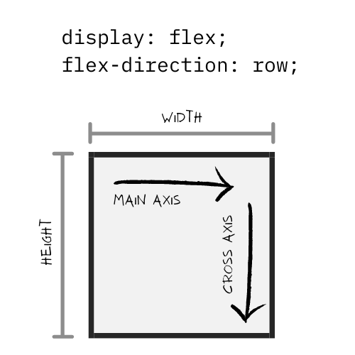
Each flex container will take up space (width, height) and the flex items within it will be placed along either the main or cross axis.
We can determine the main and cross axis based on the flex-direction property, which is by default, set to row. This tells us that the main axis is horizontal and the cross axis is vertical. If you need to change the direction of the main/cross axes, you can do so like this:
.container {
  display: flex;
  flex-direction: column;
}
Here's what this does:
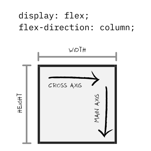
Changing this single property changes the main and cross axes, which influences how the flex items are arranged within the flex container. In the Codepen below, click the button to toggle between the two states.
What if the container size changes?
In the Codepen example above, I gave the flex container a width of 300px and a height of 200px. What if I omitted these?
Just like regular block elements, a flex container without explicit height/width values will occupy 100% width and the height will be based on the height of the content within.
An Important Preface to the Rest of This Post
For the remainder of this post, I will be using the following flex settings:
.flex-container {
  display: flex;
  flex-direction: row; /* main axis is horizontal, cross axis is vertical */
}
It would be redundant to show examples with a flex-direction of both row AND column. Since we will be working with a main axis that is horizontal, all our calculations will be done on the "width" property of elements, but if the main axis was column, we would have to look at the "height" property.
Alignment of Flex Items
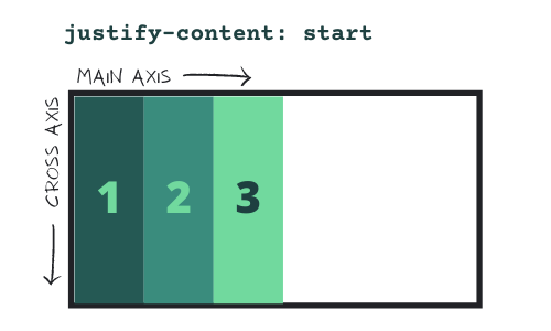
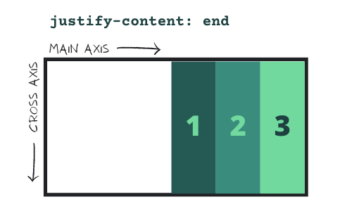
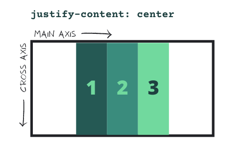
Main Axis Alignment (justify-content)
By using the justify-content property on the flex container, you can influence how the flex items are aligned on the main axis.
.container {
  display: flex;
  flex-direction: row;
  justify-content: start (default) | end | center | space-between | space-around
    | space-evenly; /* Use this to align items on the main axis */
}
There are six values here that you'll want to know. You can test them out here, or see them visually below.
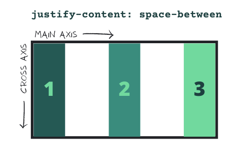
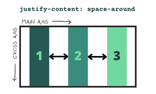
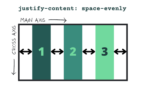
As a clarification, the difference between space-around and space-evenly is subtle, but there is a difference. With space-around, the space between flex items will be equal, but the space on the edges will not. With space-evenly, all empty space will be equal.
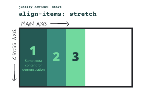
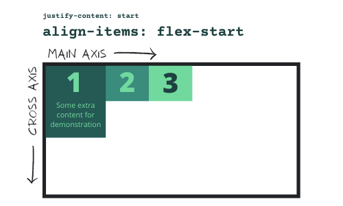
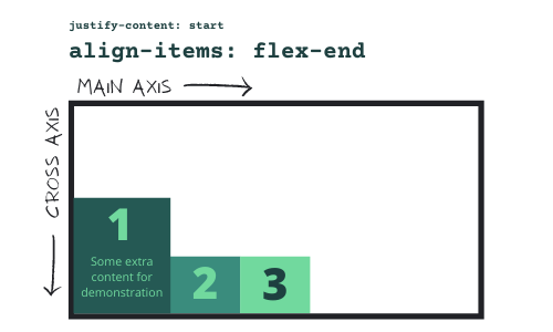
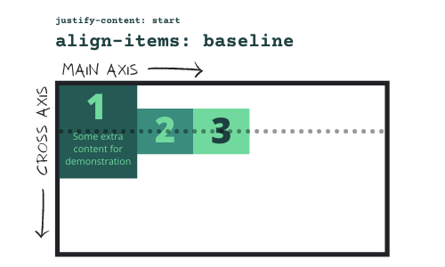
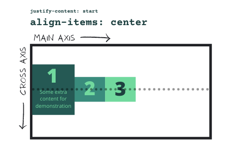
Cross Axis Alignment (align-items)
In addition to alignment on the main axis, we can align on the cross axis.
Before we look at the possibilities, I want to bring your attention to something. In the above examples, you'll notice that all the flex items occupy 100% height. This is because the default value for align-items is normal (see docs). The value "normal" can mean different things in different situations. In this case, "normal" means "stretch", which will automatically "stretch" the height of flex items to fit the height of the flex container.
Once we start applying some of these cross axis alignment values, you will notice that the flex items will no longer "stretch" to be the full height of the container.
With the align-items property, there are five main values. Depending on the "natural" height of each flex item, these will look different.
Overflowing flex items
So far, we have looked at simple examples. But what if you have so many flex items in a flex container that they don't fit within the defined space?
To illustrate this, let's put together the following scenario:
- Flex Container size
- 4px border
- 408px width (we will use border-box sizing, so need to add left + right border of 4px each to get 8px, and then add that to total width of 400px to get 408px)
- 200px height
- Flex items size
- 50px width
- 50px height
In this scenario, you can fit a total of 8 flex items within the flex container (50px * 8 = 400px). Looks pretty good so far–if you inspect this Codepen with dev tools, you can confirm that each flex item is exactly 50x50 pixels.
But what if we doubled the number of squares? Instead of 8, we had 16? Here's what happens.
There are a few weird things going on here:
- It appears that most of these flex items are NOT 50px wide (actually, none of them are). We set a width of 50px, so why is this happening?
- Flex items overflowing the container, which is clearly a problem we will want to fix.
When you work with Flexbox, if the total dimensions of the flex items exceed the dimensions of the flex container, they will first shrink to their smallest possible dimensions, and if they still do not fit in the container, they will overflow.
If items are overflowing outside your container, you have two options:
- Specify what you want to do with the overflowing flex items
- Wrap the overflowing flex items to the next line
In CSS (not just Flexbox), there is a property called overflow that you can specify on a container to define how it handles overflowing content. Here are the possible options. If you set this property to overflow: auto on the container, a scrollbar will appear and the overflowing flex items will hide. You can then scroll to see them!
But if you are creating a grid of items, you probably don't want your users to have to scroll to see all of them. You probably want to just wrap them to the next line. Instead of setting the overflow CSS property, we can set the flex-wrap property on the flex container.
.flex-container {
  display: flex;
  flex-wrap: wrap;
}
Here is what happens when we do that.
Looks a lot better right? But what's up with that whitespace between the items?
We just talked about align-items earlier, so you might be inclined to try something like this to fix that:
.flex-container {
  display: flex;
  flex-wrap: wrap;
  align-items: flex-start; /* This should remove the whitespace right??... */
}
By now, I hope you're getting used to me saying this but... When we added the flex-wrap property, the rules of the game changed. Again.
When we set this property to anything other than the default, we now must use align-content rather than align-items to position the wrapped flex items on the cross axis.
Here are the possible values. They are basically the same as the values for align-items. We'll go with flex-start to put all of the items at the beginning of the container and remove that whitespace in the middle.
.flex-container {
  display: flex;
  flex-wrap: wrap;
  align-content: flex-start; /* Use align-content when flex-wrap: wrap is set.  Otherwise, use align-items */
}
Here's what that looks like:
Just remember, if flex-wrap is set to anything OTHER THAN nowrap (default), use align-content, NOT align-items to arrange flex item groups on the cross axis.
Flex Item Properties
To this point, we have covered all the flex container CSS properties, but that's not all we can do! At the flex-item level, we can do two main things:
- Change the alignment of a flex item
- Change the size of a flex item
Let's start with the first one because it is a much simpler discussion.
Aligning a single flex item
If you want to take a single flex item and align it differently than the rest, you can use the align-self property. Remember though, this CSS rule must be applied to that individual item, NOT the container.
Look at this magic:
Feel free to click on the CSS of the Codepen, but here's a summary:
- Flex items 1, 5 -
align-self: flex-start - Flex items 2, 4, 6, 8 -
align-self: center - Flex items 3, 7 -
align-self: flex-end
Sizing flex items
In my opinion, this is the hardest part of Flexbox, but if you have a solid understanding of everything above, it shouldn't be too overwhelming.
With the prior examples above, we set explicit width and height properties on our flex items (50x50 pixels). When the total dimensions of these items does NOT exceed that of the flex container, we see that they maintain these width and height properties of 50x50, but when we add too many, they start to shrink to try and fit into the container, and then overflow (if we omit the flex-wrap: wrap property).
While it might seem obvious why an element with width: 50px is 50 pixels wide, when dealing with Flexbox, this does not tell the entire story!
flex-grow: 0- If (and only if) the main axis has extra space, this is the factor which an item will "grow" to fit that empty space (we will explore this more later). The value of0means that by default, the item will NOT grow to fit the remaining space.flex-shrink: 1- If (and only if) the main axis DOES NOT have extra space, this factor determines whether the flex item will "shrink to fit" or not. The value of1means that by default, the item will shrink to fit the container.flex-basis: auto- The value "auto" is another way of saying, "look at my height and width properties for sizing". In our example above, a value of "auto" here means that each flex item will equal 50x50 pixels (because that's what we set the width and height to).
flex-grow
I know this is confusing, but let's take a look at the following example and reason through it.
In this example, we have the following conditions:
- 50x50 pixel flex items (x4)
- 408px width flex container w/4px border (so effectively, this is a 400px wide container, which can fit 8 total flex items of the above size)
- All flex items:
flex-grow: 0(the default) - All flex items:
flex-shrink: 1(the default) - All flex items:
flex-basis: auto(the default)
Since we have four flex items with 50px widths, that means that the total space on the main axis is allocated as follows:
- Occupied space: 200px (50px * 4 items)
- Unoccupied space: 200px (Total width - Occupied space)
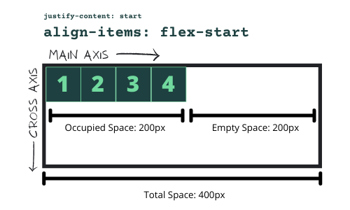
At the moment, all four of our flex items have a flex-grow factor of 0. This means that if there is empty space (which there is, 200px), each item will take up 0% of it. Let's say we wanted to change this rule to say that if there is empty space, items 2 and 4 will each occupy 50% of it. Here's how we would write that in CSS.
.flex-container {
  display: flex;
}

.flex-item-1 {
  flex-grow: 0;
}

.flex-item-2 {
  flex-grow: 1;
}

.flex-item-3 {
  flex-grow: 0;
}

.flex-item-4 {
  flex-grow: 1;
}
And here is what that looks like in real life:
Now here is where it gets a bit confusing. By specifying a flex-grow value of 1, that doesn't mean that the item gets 100% of the empty space. To calculate how much empty space it will occupy, you have to look at all the flex items in the container and sum their flex-grow values together.
Let's do some simple math:
- Total "empty" or "unallocated" space equals 200 pixels
- Total
flex-growvalues = 0 + 1 + 0 + 1 = 2 "units of space" - 200 pixels / 2 units = 100 pixels, so each "unit" equals 100 pixels
- Flex items 2 and 4 both get a single unit, so they both will equal their original width (50px) + 100px (one unit) of unoccupied space for a total of 150px of total width.
Go ahead, open up the Codepen and check the widths in dev tools!
flex-shrink
To understand this, we need to have an example where there are too many flex items for the container. Instead of 4 flex items (which leaves 200px empty space), let's go with 9 flex items, which will overflow by 50px.
Hold the phone here! If the total available width in this flex container is 400px and we just added 9 flex items that are 50px each (9 * 50 = 450px), then how on earth are they all fitting in the container?
This works because by default, all flex items have a flex-shrink value of 1. This means that if we "overflow" by 50px, each flex item will take an equal share of that overflow and shrink by that amount (so long as it doesn't shrink the items less than the size of their content).
Let's break it down again:
- 400px total width
- 9 flex items at a width of 50px each = 450px, so there is 50px of "overflow"
- Each flex item:
flex-shrink: 1 - 9 flex items, so adding the
flex-shrinkvalues up, we get 1 + 1 + 1 + 1 + 1 + 1 + 1 + 1 + 1 = 9 units - 50px of overflow / 9 units = 5.55px
- So... each flex item will reduce from an original size of 50px to a size of 50px - 5.55px = 44.45px
Go ahead, open up dev tools and check. Each flex item should now have a width of 44.45px.
But wait a minute... Didn't we try this "overflow" thing before and some flex items broke out of the main container?
Yes. Each flex item can only shrink so far. Eventually, it reaches its smallest possible width, which is the width of its inner content. This inner content width cannot be easily derived, but if you are really curious, here's a SO answer that addresses it.
Anyways, here is our example from above, but this time, we have 1 too many flex items.
If you delete flex item 12 from the HTML, all the items will fit again. But let's see why this is the case using simple math again.
- 400px total width
- 12 flex items at width of 50px each = 600px, so there is 200px of "overflow"
- Each flex item:
flex-shrink: 1 - 12 flex items, so adding the
flex-shrinkvalues up, we get 1 + 1 + 1 + 1 + 1 + 1 + 1 + 1 + 1 + 1 + 1 + 1 = 12 units - 200px of overflow / 12 units = 16.66px
- So... each flex item will reduce from an original size of 50px to a size of 50px - 16.66px = 33.34px
Sounds great, but here's the problem... Some of our items (10, 11, and 12) cannot shrink to 33.34px, which means we are going to have some overflow. Remember, flex items can shrink, but not more than their inner content.
Let's back up. We know for sure that 9 items fit in this container, so let's go with that for now.
Let's see how we can use flex-shrink to alter how our "overflow" space is allocated to each flex item. Right now, we have 50px of "overflow" (50px flex items * 9 = 450px - 400px of total flex container space). We have to allocate that 50px "overflow" out to flex items. At the moment, each flex item has a flex-shrink value of 1, which means they will all receive an equal allocation (so long as that doesn't shrink the item smaller than its content).
What if I wanted the first 3 elements to keep their full size of 50px and let the remaining flex items absorb that 50px "overflow"? Here's how you do it:
.flex-container {
  display: flex;
}

.flex-item-1 {
  flex-shrink: 0;
}

.flex-item-2 {
  flex-shrink: 0;
}

.flex-item-3 {
  flex-shrink: 0;
}

/* No need to set the rest because they default to flex-shrink: 1 */
Now, we have flex items 1-9 with the following flex-shrink values:
- 0 + 0 + 0 + 1 + 1 + 1 + 1 + 1 + 1 = 6 "units"
- Total overflow of 50px (50px * 9 = 450px - 400px = 50px)
- 1 unit = 50 / 6 = 8.33px
So in this scenario, flex items 1-3 keep their width of 50px and the remainder are reduced by 8.33px (so long as this is possible based on their inner content width). Here it is in code:
Look closely, the first three items are 50px wide while the rest are 50px - 8.33px = 41.66px wide.
Quick Review
We know that if there is "empty space" in a flex container, flex-grow determines how flex items will occupy that space. We also know that if there is "overflow" in a flex container, flex-shrink will determine how the items will shrink to fit the space.
The last piece to the puzzle is flex-basis.
flex-basis
In all of our examples so far, the flex-basis property has been set to auto, but there are more values possible.
Here they are:
flex-basis: auto- looks forwidthandheightproperties on element, and if not found, adopts the content width and heightflex-basis: content- to avoid a lengthy, unnecessary discussion, think of this as the equivalent toautoflex-basis: %, px- In addition toautoandcontent, it can accept any values that the normal CSSwidthandheightproperties can accept.
If we change this value from auto to a specific width or height, the flex items will change size. In the example below, all the flex items have widths of 50px, but by explicitly defining widths via the flex-basis property, I can override them. You'll notice that I've assigned flex-basis values of 25%, 35%, 15% and 20% for items 1-4 respectively. These add up to 95%, so you will see a small amount of "empty space" at the far right side of the container.
The reason there is empty space is because by default, all the flex-grow values are set to 0. If I added flex-grow: 1 to any of the elements, they will no longer respect their width or flex-basis values and will expand to fill the remaining space. Let's go ahead and do that with flex item 4.
As you can see, the flex-grow, flex-shrink, flex-basis, and width/height properties all compete with each other to assign dimensions to flex items. The challenge is to know which ones will win in each situation.
Ordering Flex Items
The last part of Flexbox that I want to cover here today is the order CSS property. In any case, the most straightforward way to order HTML elements is to change their order within the HTML itself. But sometimes, when designing responsively, you may want to order the Flex Items differently based on different screen sizes. This is where the order property comes in.
It is relatively simple. By placing the order property on a single flex item, you can specify where it belongs on the main axis. In the example below, I have set each flex item to 25% width via the flex-basis property and re-ordered the items with the order property:
.flex-container {
  display: flex;
}

.flex-item-1 {
  flex-basis: 25%;
  order: 3;
}

.flex-item-2 {
  flex-basis: 25%;
  order: 4;
}

.flex-item-3 {
  flex-basis: 25%;
  order: 2;
}

.flex-item-4 {
  flex-basis: 25%;
  order: 1;
}
Here is what that looks like (note that the numbers in the boxes indicate the actual HTML order).
Conclusion and Code Challenge
Getting comfortable using Flexbox takes time. You need to build things to really grasp what this is all about. Use the post above along with this cheatsheet as you use Flexbox in your webpages and you will start to recognize how much of an improvement it is over the classic way of creating CSS layouts! You will also realize that with Flexbox (and in the next lesson, CSS Grid), CSS Frameworks are often not necessary to build beautiful designs on the web.
To reinforce these skills, I suggest watching this video where I build the following design with Flexbox! I'll see you in the video :)