Table of Contents

The goal for this lesson
By the end of this lesson, you will:
- Be able to explain to someone what CSS Grid is
- Understand the basic syntax and model of CSS Grid
- Understand how CSS Grid and Flexbox (prior lesson) relates
- Understand when to use Flexbox and when to use CSS Grid for CSS layouts (yes, they can be used together!)
- Be able to build the Holy Grail Layout with CSS Grid and Flexbox (see below)
What is CSS Grid?
CSS Grid is a 2-dimensional layout system. In other words, you can control how elements sit on both the x and y axis, which is an addition to Flexbox, which we learned in the prior lesson of this series.
Here is why we need CSS Grid in our lives:
- Before 2009 (pre Flexbox/Grid) front-end developers used "hacky" solutions to create complex layouts. This included those nasty
floatandclearproperties along with some tedious mathematical calculations. - From 2009-2017 (Flexbox exists, Grid doesn't), the CSS layout game was easier than before, but still didn't have a great solution for "high level" layouts (such as the Holy Grail layout). You could get it done with Flexbox, but this required some "tricks" and a good amount of ingenuity.
- From 2017 forward, we have CSS Grid for high-level, complex, 2-d layouts and Flexbox for simpler layouts. It's the best of both worlds.
But the next obvious question becomes... How do we know when to use CSS Grid vs. Flexbox?
When to use CSS Grid vs. Flexbox
CSS Grid and Flexbox work together. They are both part of the CSS3 spec, and while they do similar things related to layouts, they were not intended to compete with each other.
Use Grid when:
- You need full control of rows AND columns (examples: full page layouts, gallery items)
- You want to explicitly define the layout regardless of content size (i.e. if you are using Flexbox and it starts to get really complicated with a bunch of heights and widths, you probably should be using Grid)
Use Flexbox when:
- Your content is a row OR column (examples: horizontal navbar, vertical sidebar)
- You want the size of items to determine layout
We will go through an example of this later in the tutorial so you can see this in action.
One more thing before we get started...
Do all browsers support CSS Grid?
For the sake of a beginner learning front-end web development, YES. As of March 2017, all major browsers have built-in support for CSS Grid, and you shouldn't be worried about this.
For someone working in the industry who must support Internet Explorer (bless your soul) and some other old browsers, NO. You will need "fallback" styles. Luckily, with media queries, this is straightforward.
@supports (display: grid) {
  /* Put your CSS Grid styles here */
}
Everything you put in that block will apply if the browser supports CSS Grid.
Grid Container vs. Grid Items
If this heading sounds familiar, good. If not, please please please go read my Flexbox tutorial before continuing forward. This post is highly dependent on concepts we learned there and I will be glossing over them here.
Just like we had "Flex containers" and "Flex Items", with CSS Grid, we have "Grid Containers" and "Grid Items".
Look at the following HTML and CSS.
<div class="grid-container">
  <div class="grid-item">1</div>
  <div class="grid-item">2</div>
  <div class="grid-item">3</div>
</div>
.grid-container {
  display: grid;
}
Like Flexbox, we activate CSS Grid by setting the display CSS property.
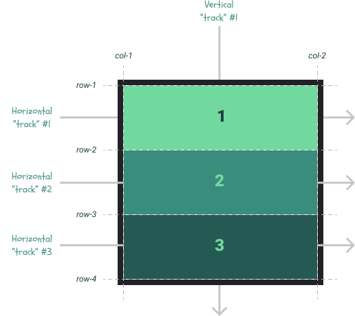
With a few tweaks to the grid settings and some additional color styles on the grid items, you can create something that looks like this:
As a preview to the remainder of the tutorial, notice the following things.
- The above visual is one of many examples I could have used. For our example, I kept things simple and made our grid perfectly square (3 rows, 3 columns, all equal height and width)
- The dotted lines are important. These are the boundaries for our grid.
- With CSS Grid, we call the rows and columns "tracks"
Understanding CSS Grid is all about knowing how to manipulate the size and location of each grid item. To do that, we have several container-level properties and several grid-item-level properties available.
Before you freak out
What you're about to see is a long list of CSS properties that we can use with CSS Grid. At first glance, they are intimidating, but if you went through my Flexbox tutorial, you have the foundation required to understand this stuff well. We will add some new concepts, but most of the content to follow is "layers" on top of what you already know. I'm confident that the overwhelm you're about to feel will subside quickly as we dive in.
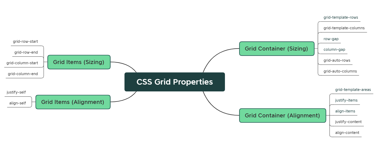
Grid Container vs. Grid Item Properties
Consistent with my prior tutorial on Flexbox, here are two cheat-sheets for CSS Grid that have really helped me. When I was learning, I kept them open constantly. I recommend you do the same for a couple weeks.
- Cheat Sheet #1 - Great for experimenting with different property values in a live setting
- Cheat Sheet #2 - Great for visualizing properties based on their container vs. item classification (as I've done below)
Also consistent with previous tutorials, below are links to the MDN documentation for CSS Grid properties. I will explain each of these in detail throughout the post.
Grid Container Properties
Set these properties on the HTML "container" you want to turn into a grid. Don't memorize these; we'll learn how they work later.
Activate the Grid
- display: grid - Activates CSS Grid system on your HTML elements (other valid values include
inline-gridandsubgrid, but we won't cover these here)
Sizing
- grid-template-rows - Defines the size of the grid rows
- grid-template-columns - Defines the size of the grid columns
- row-gap - Defines the size of the horizontal "gutters" between rows
- column-gap - Defines the size of the vertical "gutters" between columns
- grid-auto-rows - When you don't explicitly set a row's size (via
grid-template-rows), the size is determined by this value. - grid-auto-columns - When you don't explicitly set a column's size (via
grid-template-columns), the size is determined by this value.
Alignment
- grid-auto-flow - Sets the algorithm used to place grid items that you don't explicitly place
- grid-template-areas - A bit hard to explain this property without an example. I will cover this later in the tutorial.
- justify-items - Aligns items along the horizontal axis within their grid areas
- align-items - Aligns items along the vertical axis within their grid areas
- justify-content - Aligns the grid item "group" along the horizontal axis (similar to how we used it in Flexbox where
flex-direction: row) - align-content - Aligns the grid item "group" along the vertical axis (a bit different than how we used it with Flexbox)
Grid Item Properties
Sizing
- grid-row-start - For a given grid item, defines the vertical starting point
- grid-row-end - For a given grid item, defines the vertical ending point
- grid-column-start - For a given grid item, defines the horizontal ending point
- grid-column-end - For a given grid item, defines the horizontal ending point
Alignment
- justify-self - Aligns a single grid item on the horizontal axis
- align-self - Aligns a single grid item on the vertical axis
Here is a visual of all these properties in one spot.
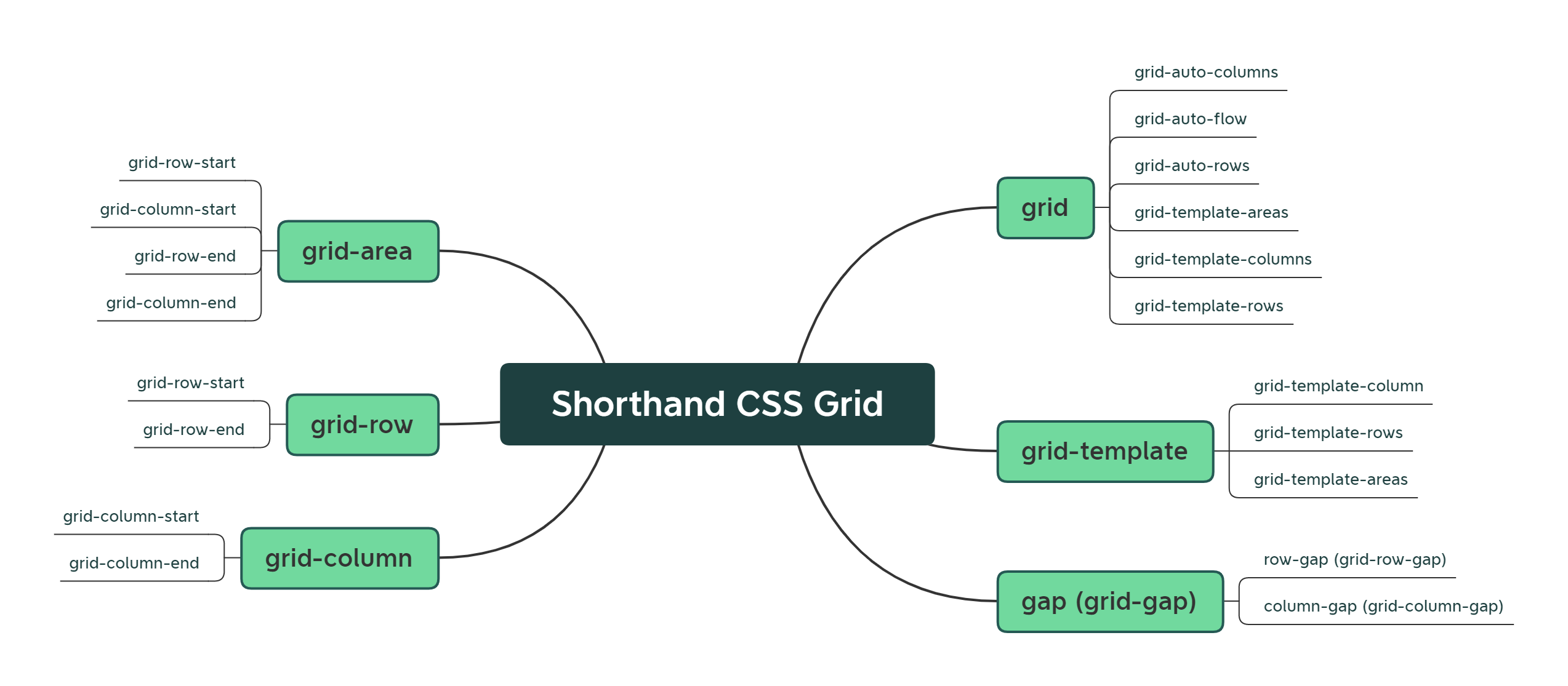
Shorthand Grid Properties
Just like Flexbox, Grid has shorthand properties that combine some of the above properties together. Remember this?
/* Both rules below are equivalent. */
.flex-container {
  flex-grow: 0;
  flex-shrink: 1;
  flex-basis: auto;
}

.flex-container {
  /* Shorthand property for Flexbox!
     Equivalent to:

     flex: <flex-grow> <flex-shrink> <flex-basis> */
  flex: 0 1 auto;
}
We can do similar things with CSS Grid. I do not recommend using these until you have become comfortable with the longhand properties above. Nevertheless, here they are:
- grid - The shorthand of all shorthand properties. This defines pretty much everything at once (row, columns, areas, flow)
- grid-template - Similar to
grid, but less comprehensive. Defines the rows, columns, and areas of the grid. - gap (grid-gap) - Defines all the "gutters" at once
- grid-area - Defines the entire area of a grid item at once
- grid-row - A subset of
grid-area, this defines the row sizing of a grid item - grid-column - A subset of
grid-area, this defines the column sizing of a grid item
And if you need to see these visually like I do, here is a mind map to reference.
Part 1: Constructing the Grid
While I'm confident we can get through this topic without much confusion, it's going to require a methodical series of steps. Read carefully and don't skip ahead. This goes in a specific order.
First off, let's construct the "playground" we are going to use to explore CSS Grid. In the Codepen below, the only grid-related property I have set is this:
.grid-container {
  display: grid;
}
The Grid itself is activated, but we haven't set any properties on it yet. Please read through the CSS comments in the Codepen below and get yourself comfortable.
Visually speaking, here is what we are dealing with.
In "grid speak", here is what we have done. Since all of these properties default to these values, you could delete everything below and achieve the same layout as above.
.grid-container {
  display: grid;
  grid-template-rows: auto auto auto;
  grid-template-columns: auto;
  align-items: stretch;
  justify-items: stretch;
}

.gi-1 {
  grid-row-start: 1;
  grid-row-end: 2;
  grid-column-start: 1;
  grid-column-end: 2;
}

.gi-2 {
  grid-row-start: 2;
  grid-row-end: 3;
  grid-column-start: 1;
  grid-column-end: 2;
}

.gi-3 {
  grid-row-start: 3;
  grid-row-end: 4;
  grid-column-start: 1;
  grid-column-end: 2;
}
The Grid Template
There is a lot to unpack here. Let's start with these two properties:
grid-template-rowsgrid-template-columns
These two properties alone will define our "gridlines", and ultimately, the structure of our "grid".
If we don't set these properties explicitly, we get something called an "implicit grid", which will always be 1 column wide and the number of rows will be based on the number of grid items. In our case, we had 1 column X 3 rows (because we had 3 grid items).
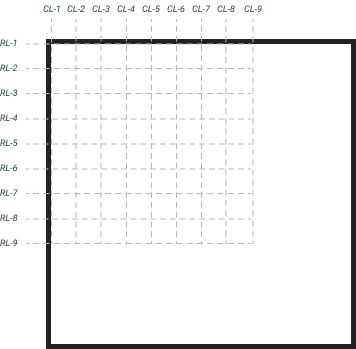
To really see this in action, let's remove the grid items for a moment and look at examples. We will start simple:
.grid-container {
  display: grid;
  grid-template-rows: 1fr 1fr 1fr;
  grid-template-columns: 2fr 1fr;
}
When you see fr, this means "fractional unit", and works identically to how our flex-grow and flex-shrink values did in our Flexbox tutorial (again, if you haven't please read it before moving on).
In the example above, we have defined grid-template-rows in 3 equal parts. We have allocated 3 "fractional units" (1fr + 1fr + 1fr), so each row will receive 33.33% of the available grid space. We defined grid-template-columns in 2 parts, but they are not equal. In total, we have allocated 3 fr units, but gave 2 of them to the first column and 1 to the second. If each unit is equal to 33.33% (1/3), then the first column will be 66.66% wide and the second column will be 33.33% wide. Here is the grid we just defined:
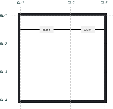
One thing that you'll notice is that we have 2 columns, but 3 "lines" that represent boundaries. This is similar to the fence-post math problem. Because of this, I have renamed them to CL-n and RL-n, short for "Column Line #n" and "Row Line #n".
Here's one more example.
.grid-container {
  display: grid;
  grid-template-rows: 1fr 1fr 1fr 1fr 1fr 1fr 1fr 1fr;
  grid-template-columns: 1fr 1fr 1fr 1fr 1fr 1fr 1fr 1fr;
}
We have defined 8 rows and 8 columns of equal width an height (i.e. a perfectly "square" grid). Here is what it looks like.
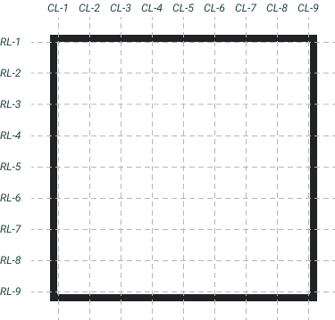
Before we move on, let's simplify our CSS by using the repeat function. In this tutorial, I won't be getting into the "shorthand" Grid properties much, but this one is simple and will save you some typing. As opposed to typing a bunch of 1fr units to define our grid, we can write this:
.grid-container {
  display: grid;
  grid-template-rows: repeat(8, 1fr);
  grid-template-columns: repeat(8, 1fr);
}
Positioning Items on the Grid
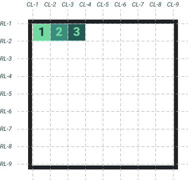
Let's keep going with that 8x8 grid example from above and add some grid items. By default, here is what we get when we add 3 grid items with no width/height and no additional Grid properties.
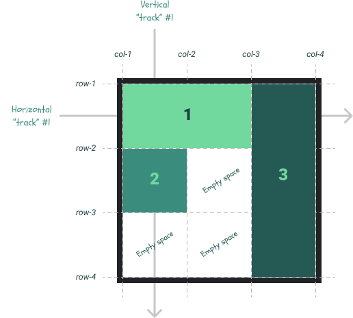
In CSS Grid terminology, the "grid area" represents the space that a grid item occupies. We have not explicitly instructed our grid to place the grid items, so they will take up 1 "cell" of the grid each. Here is a more detailed visual:
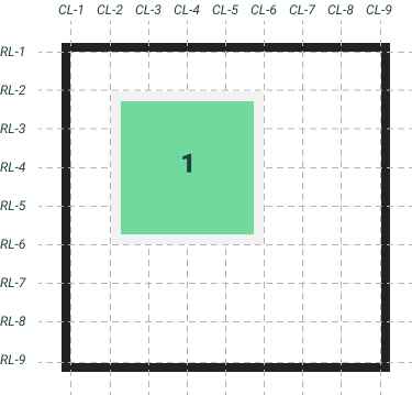
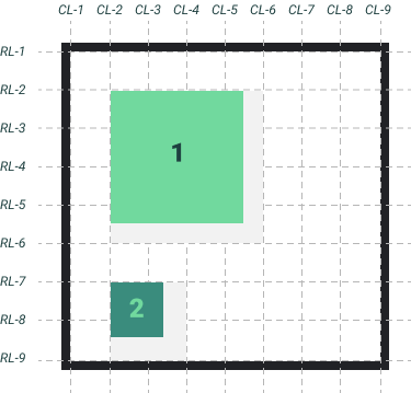
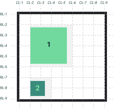
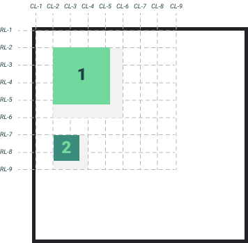
The above visual is the "default", but what if I wanted to place these three items in specific locations on the grid? Maybe something like this:
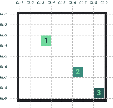
Before CSS Grid, achieving this layout would require a tremendous effort. With Grid, it's simple. To place items, you just need to specify the "line" that they start/end on from a row/column perspective. Let's break this down:
- Grid item 1
- Starts on RL-3, ends on RL-4
- Starts on CL-3, ends on CL-4
- Grid item 2
- Starts on RL-6, ends on RL-7
- Starts on CL-6, ends on CL-7
- Grid item 3
- Starts on RL-8, ends on RL-9
- Starts on CL-8, ends on CL-9
Let's take this information and translate it into CSS. All of the properties below are grid item (not container) properties.
.gi-1 {
  grid-row-start: 3;
  grid-row-end: 4;
  grid-column-start: 3;
  grid-column-end: 3;
}

.gi-2 {
  grid-row-start: 6;
  grid-row-end: 7;
  grid-column-start: 6;
  grid-column-end: 7;
}

.gi-3 {
  grid-row-start: 8;
  grid-row-end: 9;
  grid-column-start: 8;
  grid-column-end: 9;
}
Optionally, you could could have used the grid-row and grid-column properties here to simplify, but like I mentioned earlier, it is best to use the longhand properties until you are really comfortable with CSS Grid! Here's the result:
Sizing Items on the Grid
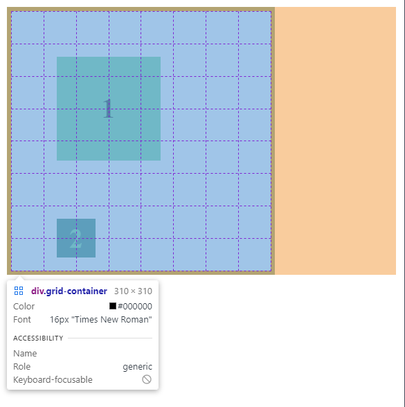
By default, our grid items are filling the space of one grid "cell" naturally. If you look at any of the Codepens above, you can see the following specs for our grid:
- The Grid container is 310px wide and 310px tall with a border of 5px. Therefore, the total available space is 300px wide and 300px tall (when
box-sizing: border-box) - The Grid is 8 x 8
- Each grid "cell" will be 37.5px wide and 37.5px tall (300px / 8)
There are two ways that we can resize them:
- Set an explicit width and height on each
- Change the
grid-row-endandgrid-column-endproperties
Option #1 isn't great because it will open a can of worms we're not ready for yet.
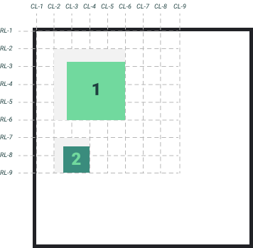
Let's try option #2 and replicate this:
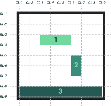
While this might seem difficult, we can use the same method we did to place the grid items above! Here's the CSS.
.gi-1 {
  grid-row-start: 3;
  grid-row-end: 4;
  grid-column-start: 3;
  grid-column-end: 6;
}

.gi-2 {
  grid-row-start: 6;
  grid-row-end: 7;
  grid-column-start: 6;
  grid-column-end: 7;
}

.gi-3 {
  grid-row-start: 8;
  grid-row-end: 9;
  grid-column-start: 8;
  grid-column-end: 9;
}
And here's the result:
Review: Setting up the Grid
At this point, you know the basics of setting up a CSS Grid container and placing/sizing items within it. The structure is relatively simple as you have seen throughout the tutorial.
<div class="grid-container">
  <div class="grid-item gi-1">1</div>
  <div class="grid-item gi-2">2</div>
  <div class="grid-item gi-3">3</div>
</div>
.grid-container {
  /* Generic CSS properties */
  width: 310px;
  height: 310px;
  border: 5px solid #212226;

  /* Grid container properties */
  display: grid;
  grid-template-rows: repeat(8, 1fr);
  grid-template-columns: repeat(8, 1fr);
}

.gi-1 {
  grid-row-start: 3;
  grid-row-end: 4;
  grid-column-start: 3;
  grid-column-end: 6;
}

.gi-2 {
  grid-row-start: 5;
  grid-row-end: 7;
  grid-column-start: 6;
  grid-column-end: 7;
}

.gi-3 {
  grid-row-start: 8;
  grid-row-end: 9;
  grid-column-start: 1;
  grid-column-end: 9;
}
While this will get you started, there is more to talk about, and certainly some details that I purposefully omitted here. We will circle back to some of these properties later. For now, let's talk about aligning grid items within the grid container AND within their "grid areas".
Basic CSS Grid Alignment
If you following this tutorial closely, you might be asking why we are talking about "alignment". Didn't we just talk about alignment?
While we discussed the placement and sizing of grid items, we did not cover their alignment, which can happen in two ways:
- Alignment within a item's "grid area"
- Alignment within a grid container
"Grid Area" Alignment
We briefly covered what a "grid area" means, but not enough for you to walk away confidently. Let's go back to our 8x8 grid and define a "grid area" that we want to experiment with.
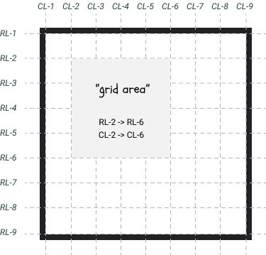
Since our grid is 8fr x 8fr, this "grid area" is 4fr x 4fr. We can place a grid item in this space using the following HTML and CSS:
<div class="grid-container">
  <div class="grid-item gi-1">1</div>
</div>
.grid-container {
  width: 310px;
  height: 310px;
  border: 5px solid #212226;
  display: grid;
  grid-template-rows: repeat(8, 1fr);
  grid-template-columns: repeat(8, 1fr);
}

.gi-1 {
  grid-row-start: 2;
  grid-row-end: 6;
  grid-column-start: 2;
  grid-column-end: 6;
}
And here it is live with some styling:
We know from earlier that the total size of a single grid "cell" is 37.5px wide and tall. Therefore, our "grid area" here is 150px wide and tall (37.5 * 4), and our grid item is stretching to fit those dimensions.
But what if we explicitly set some dimensions on our grid item? Let's set this grid item to 120px:
.gi-1 {
  width: 120px;
  height: 120px;
}
When we do this, our "grid area" will remain the same, but now our grid item does not fill 100% of it.
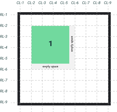
So now we've got this empty space within our "grid area". Would it be possible to center my grid item in the "grid area"? Of course! Here's the recipe:
.grid-container {
  justify-items: center; /* horizontal */
  align-items: center; /* vertical */
}
Here's what we just did:
See how our grid item is now centered in the "grid area"? Here's the code–I suggest toggling these two CSS properties on and off in the CSS to visualize what it is doing.
Seems similar to Flexbox Alignment...?
In Flexbox, we use the following two CSS properties to align items within their flex container:
justify-content- aligns items on the "main axis"align-items- aligns items on teh "cross axis"
With CSS Grid, if we want to align grid items within their "grid areas", we use these properties:
justify-items- aligns items in the horizontal direction within the grid areaalign-items- aligns items in the vertical direction within the grid area
CSS Grid also has the justify-content and align-content properties, but we aren't quite ready to explore those yet.
To make this even more clear, let's add another grid item into the equation. This time, it will occupy 2fr x 2fr units for the "grid area". This means that the "grid area" dimensions will be 75px wide and tall (37.5 * 2). We will make our second grid item 45px (arbitrary, anything less than 75px will work) wide and tall so that it has some "empty space" and we can see the effect of these alignment properties. Here's what we're dealing with (without any alignment properties set yet):
Let's go one step at a time. First, we'll set the vertical alignment of the grid items within their "grid areas".
.grid-container {
  align-items: center; /* vertical */
}
Here's what we get:
Now, we will set the horizontal alignment with justify-items.
.grid-container {
  align-items: center; /* vertical */
  justify-items: center; /* horizontal */
}
As you can see, our grid items are now centered within their "grid areas".
Here is the relevant code:
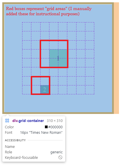
In this tutorial, I'm supplying you with visualizes that help you see what is happening, but how would we verify these things without them?
Glad you asked–if you open up the Google Chrome Developer Tools (other browsers like Firefox work too), you will see something like this:
Notice how our items are perfectly centered within their "grid areas".
Aligning the Entire Grid
Up to this point, we have been working in "perfect conditions":
.grid-container {
  width: 310px;
  height: 310px;
  border: 5px solid #212226;
  display: grid;
  grid-template-rows: repeat(8, 1fr);
  grid-template-columns: repeat(8, 1fr);
}
Our grid container HTML element has 300px of "available space" which is evenly filled with our grid itself (because of our grid-template rules). The repeat(8, 1fr) rule is saying "I want 8 rows and 8 columns, and I want each grid cell to evenly divide the 300px of available space". Therefore, in our examples so far, each grid cell is 37.5px wide and tall (300 / 8).
What if we changed the rule to this?
.grid-container {
  width: 310px;
  height: 310px;
  border: 5px solid #212226;
  display: grid;
  grid-template-rows: repeat(8, 25px);
  grid-template-columns: repeat(8, 25px);
}
Our grid container's available space is 300px, but now, our grid is 200px wide and tall (25px * 8). Our grid is smaller than our grid container. Here's a visual of what that might look like by default.
Let's put our grid items back on. Since we decreased the size of our grid, we need to decrease the size of our grid items. Remember:
- Grid item 1 has a "grid area" equal to 4x4, which is equal to 100x100 pixels (25 * 4 = 100)
- Grid item 2 has a "grid area" equal to 2x2, which is equal to 50x50 pixels (25 * 2 = 50)
To ensure that the grid items are smaller than their "grid areas", let's make them 50x50 and 25x25 pixels respectively (exactly half the size of their "grid areas" in each case).
Here's what our CSS looks like so far:
.grid-container {
  width: 310px;
  height: 310px;
  border: 5px solid #212226;
  display: grid;
  grid-template-rows: repeat(8, 25px);
  grid-template-columns: repeat(8, 25px);
}

.gi-1 {
  color: #1e4040;
  background-color: #71d99e;
  grid-row-start: 2;
  grid-row-end: 6;
  grid-column-start: 2;
  grid-column-end: 6;
  width: 50px;
  height: 50px;
}

.gi-2 {
  color: #71d99e;
  background-color: #3a8c7d;
  grid-row-start: 7;
  grid-row-end: 9;
  grid-column-start: 2;
  grid-column-end: 4;
  width: 25px;
  height: 25px;
}
Let's throw a little curveball here to practice our grid item alignment skills. Add the following CSS to your grid container:
.grid-container {
  justify-items: end;
  align-items: end;
}
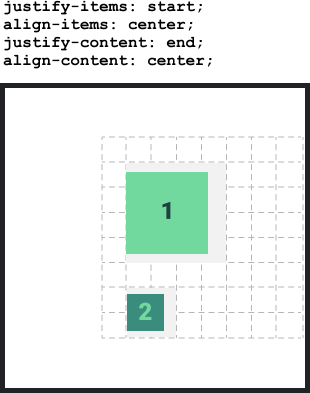
This will reposition both items to occupy the bottom-right corner of their "grid areas". Here's what that looks like:
justify-content and align-content
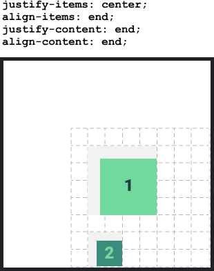
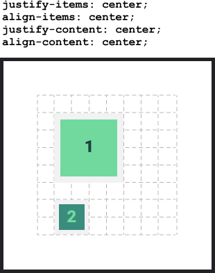
We are finally ready to see what these two properties do. Once again–if the grid size is smaller than the grid container size, these properties will align the ENTIRE grid within the grid container. Let's go ahead and center our grid by adding these properties to the container.
.grid-container {
  justify-content: center;
  align-content: center;
}
Here's what we get:
In the image above, it's obvious what is happening. The entire grid is centered within the grid container and the grid items are placed at the end of their "grid areas". Once we turn this into code, it's not so obvious:
But once again, you can open your developer tools and hover over the grid to see a clearer picture of what's going on. The developer tools do not highlight the "grid areas" that we talked about, so I added those in manually. Since we defined our grid items to be perfect multiples of the grid area sizes, they fit perfectly within the grid cells.
More Grid Alignment Examples
It would be overly tedious for me to create visuals for every possible alignment combination. That is what cheat sheets are for. Nevertheless, I want to give you a few more examples to look at to better understand these grid alignment properties.
Example 1
Example 2
Example 3
CSS Grid Basics Summary
At this point, I've shown you the basics of CSS Grid. There is a lot more that you can do with it, but we've got the core concepts in place.
Before moving on with the tutorial, you should feel comfortable explaining how the following CSS properties are used in the context of the CSS Grid system.
- Container Properties
display: grid- activates the gridgrid-template-rows/grid-template-columns- Defines the number of rows/columns in the gridjustify-content/align-content- Aligns the entire grid (if it is smaller than its container)justify-items/align-items- Aligns grid items within their "grid areas" (which are defined at the item level)
- Grid Item Properties
grid-row-start/grid-row-end- Defines the horizontal "grid area" for an itemgrid-column-start/grid-column-end- Defines the vertical "grid area" for an item
A Quick CSS Grid Challenge
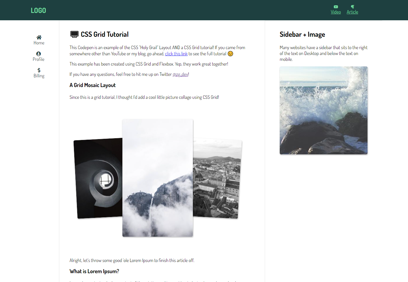
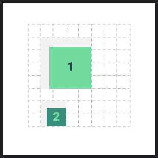
With your current knowledge, you should be able to create the design from the very beginning of this tutorial:
Here is a starter Codepen (just hit the "fork" button to copy it to your account) along with the solution:
- Starter - https://codepen.io/zg_dev/pen/JjENBKX
- Solution - https://codepen.io/zg_dev/pen/gOgWjMo
- Solution (using shorthand Grid properties) - https://codepen.io/zg_dev/pen/WNRjKEL
Intermediate CSS Grid
The remainder of the tutorial will be an exploration of CSS Grid properties and how we can make the most out of this system. While the following content is not required to use CSS Grid effectively, I highly recommend reading all of it. I do not intend to cover every remaining detail of CSS Grid, but rather point out the most useful parts that we haven't touched on thus far.
CSS Grid "Gutters"
When you make a grid on a web page, you're most likely going to want some spacing between your grid items. We could create this spacing with padding, margin, or even some Flexbox magic, but there is no need to when you have the power of CSS Grid. We call this spacing "gutters" and it is easy to do with the row-gap and column-gap properties.
Let's start with a basic 3x3 grid.
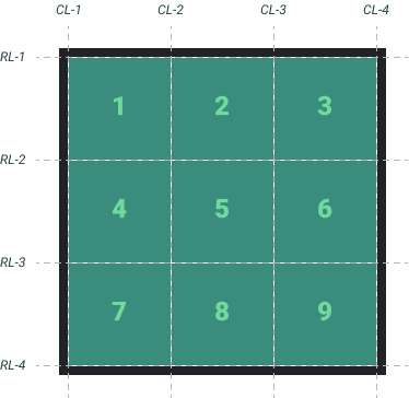
Here are the CSS Grid properties you need to create this:
<div class="grid-container">
  <div class="grid-item gi-1">1</div>
  <div class="grid-item gi-2">2</div>
  <div class="grid-item gi-3">3</div>
  <div class="grid-item gi-4">4</div>
  <div class="grid-item gi-5">5</div>
  <div class="grid-item gi-6">6</div>
  <div class="grid-item gi-7">7</div>
  <div class="grid-item gi-8">8</div>
  <div class="grid-item gi-9">9</div>
</div>
.grid-container {
  display: grid;
  grid-template-rows: repeat(3, 1fr);
  grid-template-columns: repeat(3, 1fr);
}
Let's add some gutters:
.grid-container {
  row-gap: 10px;
  column-gap: 10px;
}
Yep, it's really that easy. Just add your desired "gutter" width and your grid items will magically space themselves out in a responsive way.
To reinforce some concepts from earlier, let's reduce the size of our grid and center it in its container. Remember, we have 300px of space available within the grid container, so if we set the width/height of each grid "cell" to 50 pixels, the total grid size will now be 50 + 50 + 50 = 150px. After doing that, we can use justify-content and align-content to center our grid in the grid container. Here are the changes I'm making to achieve this:
.grid-container {
  /* REMOVE THIS

  grid-template-rows: repeat(3, 1fr);
  grid-template-columns: repeat(3, 1fr);

  */

  /* ADD THIS */
  grid-template-rows: repeat(3, 50px);
  grid-template-columns: repeat(3, 50px);
  justify-content: center;
  align-content: center;
}
CSS Grid Automatic Flow
Do you remember from the Flexbox tutorial where we talked about the flex-direction property?
If you set the value to row, your flex items would be horizontally aligned. If set to column, they would be vertically aligned.
With CSS Grid, we don't have the concept of a "main axis" and "cross axis", but we do have the ability to change the natural flow of grid elements.
Let's say you have a basic grid with the following HTML and CSS:
<div class="grid-container">
  <div class="grid-item gi-1">1</div>
  <div class="grid-item gi-2">2</div>
  <div class="grid-item gi-3">3</div>
  <div class="grid-item gi-4">4</div>
</div>
.grid-container {
  display: grid;
  grid-template-rows: repeat(3, 1fr);
  grid-template-columns: repeat(3, 1fr);
}
Since we haven't explicitly defined where each grid item goes on the grid yet, where would you expect them to be?
By default, they are aligned horizontally on the grid, and overflow to the next row if there are too many items. In this case, we have 3 columns defined in our grid and 4 items, so the first three will line up horizontally, and the final item will break to the next row.
If we wanted, we could explicitly place each grid item to stack on top of each other vertically, but that's a lot of work! If you wanted to change the "flow" of these grid items, all you need is the grid-auto-flow property, which acts similarly to the Flexbox flex-direction property. Most commonly, you will be using either row (the default value) or column. Let's change it to column and see what happens.
.grid-container {
  grid-auto-flow: column;
}
Just like that, our grid looks completely different!
You can also set this to dense, which will look for empty spaces in your grid and place smaller grid items in them (even if they are not in the right order). I won't be covering this here, but feel free to experiment with it as it could be good use-case for picture grids.
Explicit vs. Implicit Grid
Let's say we have this grid:
<div class="grid-container">
  <div class="grid-item gi-1">1</div>
  <div class="grid-item gi-2">2</div>
  <div class="grid-item gi-3">3</div>
  <div class="grid-item gi-4">4</div>
</div>
.grid-container {
  display: grid;
  grid-template-rows: 1fr;
  grid-template-columns: repeat(3, 1fr);
}
We have not explicitly placed or sized the grid items, which means they will do two things by default:
- Flow in the row direction (thanks to the default value of the
grid-auto-flowproperty set torow) - Each item will stretch to fill its "grid area" (thanks to the default value of
justify-items, which isstretch)
Since we defined 3 columns and 1 row, the first 3 grid items will occupy the first row, and the 4th grid item will... Occupy the 2nd row? But wait, we didn't define a second row...
The fourth grid item is part of what we call the Implicit Grid.
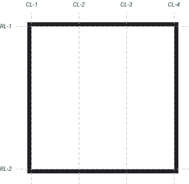
Let's back up. Our Explicit Grid is a 1 x 3 (row x col) grid, defined by these properties:
.grid-container {
  display: grid;
  grid-template-rows: 1fr; /* Defines 1 row that fills the entire grid space */
  grid-template-columns: repeat(3, 1fr); /* Defines 3 columns of equal space */
}
Naturally, these allows 3 items to fit nicely in the grid. If we have 4 or more items, they will start occupying the Implicit Grid. By default, "extra" items will flow according to the grid-auto-flow property and will take up space equal to the size of their content.
We can change this behavior with the grid-auto-rows and grid-auto-columns properties. Instead of sizing the Implicit Grid according to content size, let's give it some dimensions.
.grid-container {
  display: grid;

  /* Explicit Grid */
  grid-template-rows: 1fr;
  grid-template-columns: repeat(3, 1fr);

  /* Implicit Grid Behavior */
  grid-auto-flow: row; /* This is the default, but setting it anyways for demonstration */
  grid-auto-rows: 100px;
  grid-auto-columns: 50px;
}
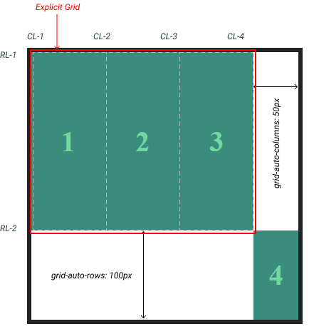
This means that any grid item placed on the Implicit Grid will have a height of 100px (row height) and width of 50px (column width). Let's go ahead and place our 4th grid item on this Implicit Grid:
.gi-4 {
  grid-row-start: 2;
  grid-row-end: 3;
  grid-column-start: 4;
  grid-column-end: 5;
}
Remember, our explicit grid looks like this:
In the CSS above, we are saying, "place grid item 4 between RL-2 and RL-3, and between CL-4 and CL-5". But wait, those don't exist?!
Sure, they don't exist, but we can still place grid items on them. The explicit grid will shrink and our grid item will be placed and sized on the Implicit Grid according to the grid-auto-rows and grid-auto-columns properties, which are 100px and 50px respectively in this situation. Therefore, our 4th grid item will be 100px tall and 50px wide. See below:
Below, I have highlighted these concepts in more detail:
After seeing this, you may have the question, "Why would we ever need this?".
If you are ever building a grid where you don't know how many items you will have, it is a good practice to set the grid-auto-rows and grid-auto-columns properties. If you want some flexibility, you can add something like this:
.grid-container {
  grid-auto-rows: minmax(100px, auto);
  grid-auto-columns: minmax(50px, auto);
}
By doing this, you are declaring that all grid items that fill the Implicit Grid will have a minimum width and height of 50px and 100px respectively. If those grid items have content larger then these dimensions, then their width and height will be set to auto.
A Different Way to Use CSS Grid
We are almost to the finish line. The only property that we have not yet covered is the grid-template-areas property. I saved this for last because it is not necessary to use, but provides an easy way to define "grid areas". Up to this point, we placed grid items using the following method:
We first define the grid:
.grid-container {
  width: 310px;
  height: 310px;
  border: 5px solid #212226;
  display: grid;
  grid-template-rows: repeat(3, 1fr);
  grid-template-columns: repeat(3, 1fr);
}
Then, we explicitly place each grid item using the grid "lines":
.gi-1 {
  grid-row-start: 1;
  grid-row-end: 2;
  grid-column-start: 1;
  grid-column-end: 3;
}

.gi-2 {
  grid-row-start: 2;
  grid-row-end: 3;
  grid-column-start: 1;
  grid-column-end: 2;
}

.gi-3 {
  grid-row-start: 1;
  grid-row-end: 4;
  grid-column-start: 3;
  grid-column-end: 4;
}
With the grid-template-areas, we can achieve the same result in a different way:
.grid-container {
  grid-template-areas:
    "item1 item1 item3"
    "item2 . item3"
    ". . item3";
}

.gi-1 {
  grid-area: item1;
}

.gi-2 {
  grid-area: item2;
}

.gi-3 {
  grid-area: item3;
}
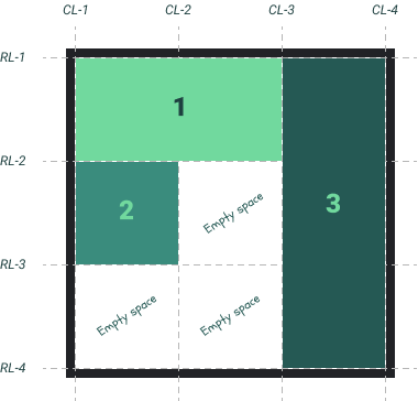
The syntax here looks odd, but it is a much more "visual" way to use CSS Grid. In the .grid-container styles, notice how we have 3 quotation groups separated by spaces. Since we have defined a 3x3 grid, the quotation groups represent the rows while the individual items represent the columns. Furthermore, the . represents "empty space".
In each grid item style, we are defined that item's "alias" which as you can see, is used above in the grid-template-areas.
Let me format this so it is clearer what is happening:
"item1    item1    item3"
"item2      .      item3"
"  .        .      item3"
Notice how "item3" fills the entire 3rd column? Take a look at the Codepen above.
You can quickly see what's going on here and for some, this is a more intuitive way to create grids.
Naming your Grid Lines
In the above section, we talked about a more intuitive way to create a CSS Grid. This section will offer another alternative.
You've seen this already:
For educational purposes, I have been labeling the grid "lines" as "CL-n" and "RL-n" to indicate "Column Line 1" and "Row Line 1", but when we translate this into CSS, it looks like this:
.gi-1 {
  grid-row-start: 1;
  grid-row-end: 2;
  grid-column-start: 1;
  grid-column-end: 3;
}
If we needed a way to remember the line names, we could assign them on the grid container:
.grid-container {
  display: grid;
  grid-template-rows: [RL-1] 1fr [RL-2] 1fr [RL-3] 1fr [RL-4];
  grid-template-columns: [CL-1] 1fr [CL-2] 1fr [CL-3] 1fr [CL-4];
}
And then use them on the grid items:
.gi-1 {
  grid-row-start: RL-1;
  grid-row-end: RL-2;
  grid-column-start: CL-1;
  grid-column-end: CL-3;
}
Here's a demo:
CSS Grid and Flexbox Work Together
I said at the beginning of this tutorial that we would go through an example so you can see how Flexbox and CSS Grid play nicely together. As a refresher, here are a few rules-of-thumb to go by when deciding between Flexbox and Grid:
Use Grid when:
- You need full control of rows AND columns (examples: full page layouts, gallery items)
- You want to explicitly define the layout regardless of content size (i.e. if you are using Flexbox and it starts to get really complicated with a bunch of heights and widths, you probably should be using Grid)
Use Flexbox when:
- Your content is a row OR column (examples: horizontal navbar, vertical sidebar)
- You want the size of items to determine layout
Below, I have created two examples that use CSS Grid and Flexbox interchangeably. I suggest spending 10 minutes reading through the CSS of each.
Picture Gallery
A simple picture gallery with a "sticky" navbar and footer. This layout would require a few "hacky" CSS tricks to achieve before, but with Grid and Flexbox, it is relatively straightforward. In particular, there are a few critical pieces to this that you should focus on while reading through the code:
- Notice how I have placed a "grid inside a grid". This is perfectly okay.
- Notice that the main
grid-containerhas a100vhheight, and has set the main content (the pictures) to a unit of1fr. This means that the navbar and footer will get their explicitly defined heights of 70px and 40px and the picture grid will take up the remaining space in the viewport (visible screen). - Notice that I set the
.picturesgrid to have anoverflow: scrollsetting. This ensures that adding pictures to the grid will not cause our navbar or footer to disappear on scroll.